hauyeedoin · Portfolio Field Report No. 08 Pochawa Grill · Menu Evolution · 2026
Editorial Design · Information Architecture · Menu Design

Changing the visual,
not the purpose

Pochawa Grill originally used a photo-led menu to help customers quickly recognise unfamiliar dishes. During the redevelopment of the brand, that intention changed. The menu was no longer expected to show the food. Instead, it became part of introducing Korean food culture itself. That shift required every visual decision to be reconsidered, while keeping the menu understandable for people encountering the cuisine for the first time.

Client Pochawa Grill Project Menu evolution Role Creative Designer Scope Editorial design · information architecture · menu design Period June – July 2026
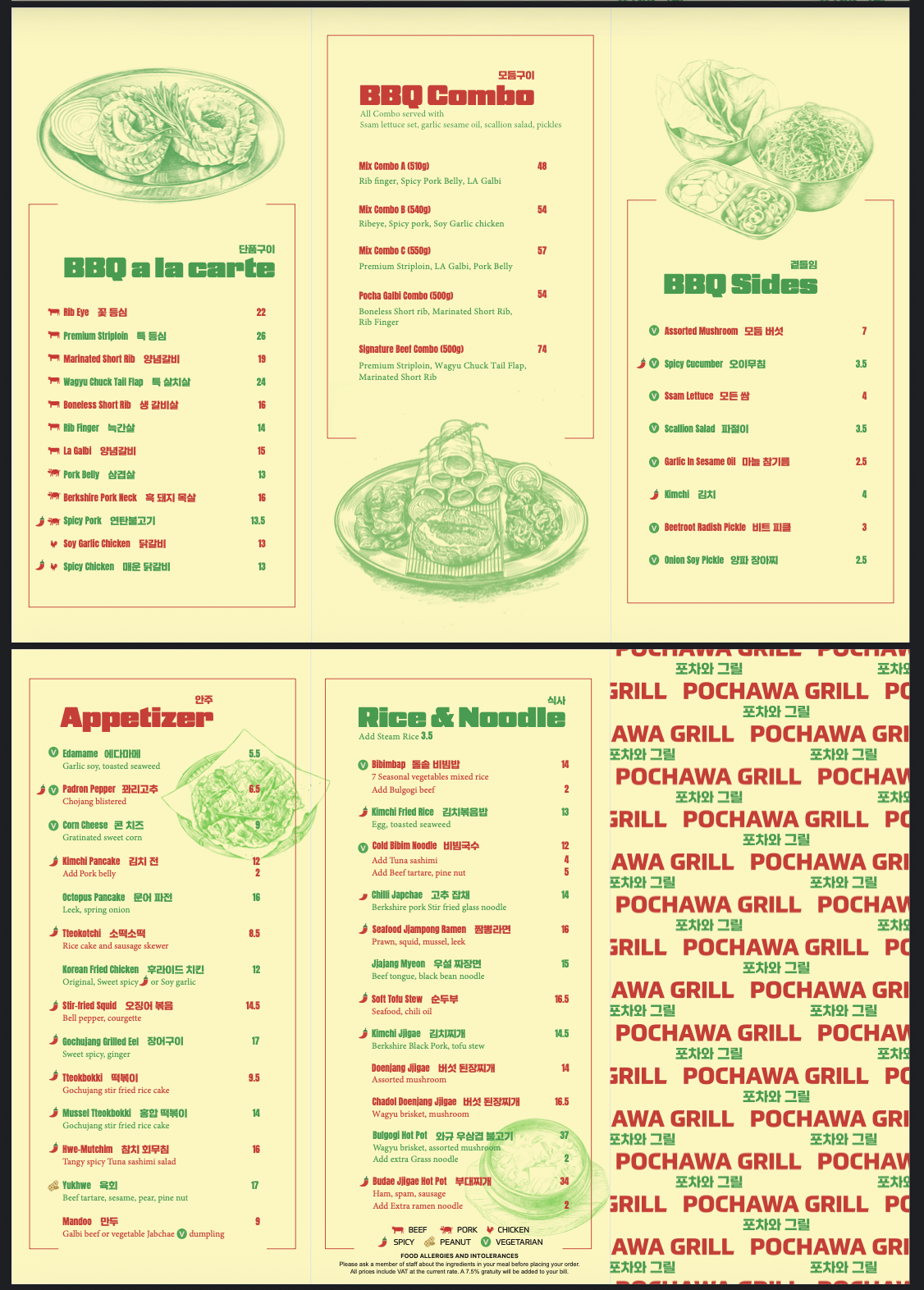
Final menu – Pochawa Grill
Final Pochawa Grill menu with typography, bilingual naming and written descriptions
The final menu replaced food photography with typography, bilingual naming and written descriptions, reflecting a new direction for the brand while maintaining clarity for customers.
The brief

Pochawa Grill had already been using a photo-led menu. During the redevelopment, a new Head Chef joined the project after working in internationally recognised hotels. He introduced a different philosophy for how the menu should work.

Rather than showing every dish, he wanted customers to imagine the food. Photography would move to posters and other promotional materials, while the menu itself would become something people read instead of something they scanned visually.

At the same time, the team wanted to keep Korean dish names rather than replacing them with familiar English equivalents. The ambition was for customers to become familiar with those names over time, just as words like sushi, ramen, kimchi and matcha have become part of everyday English.
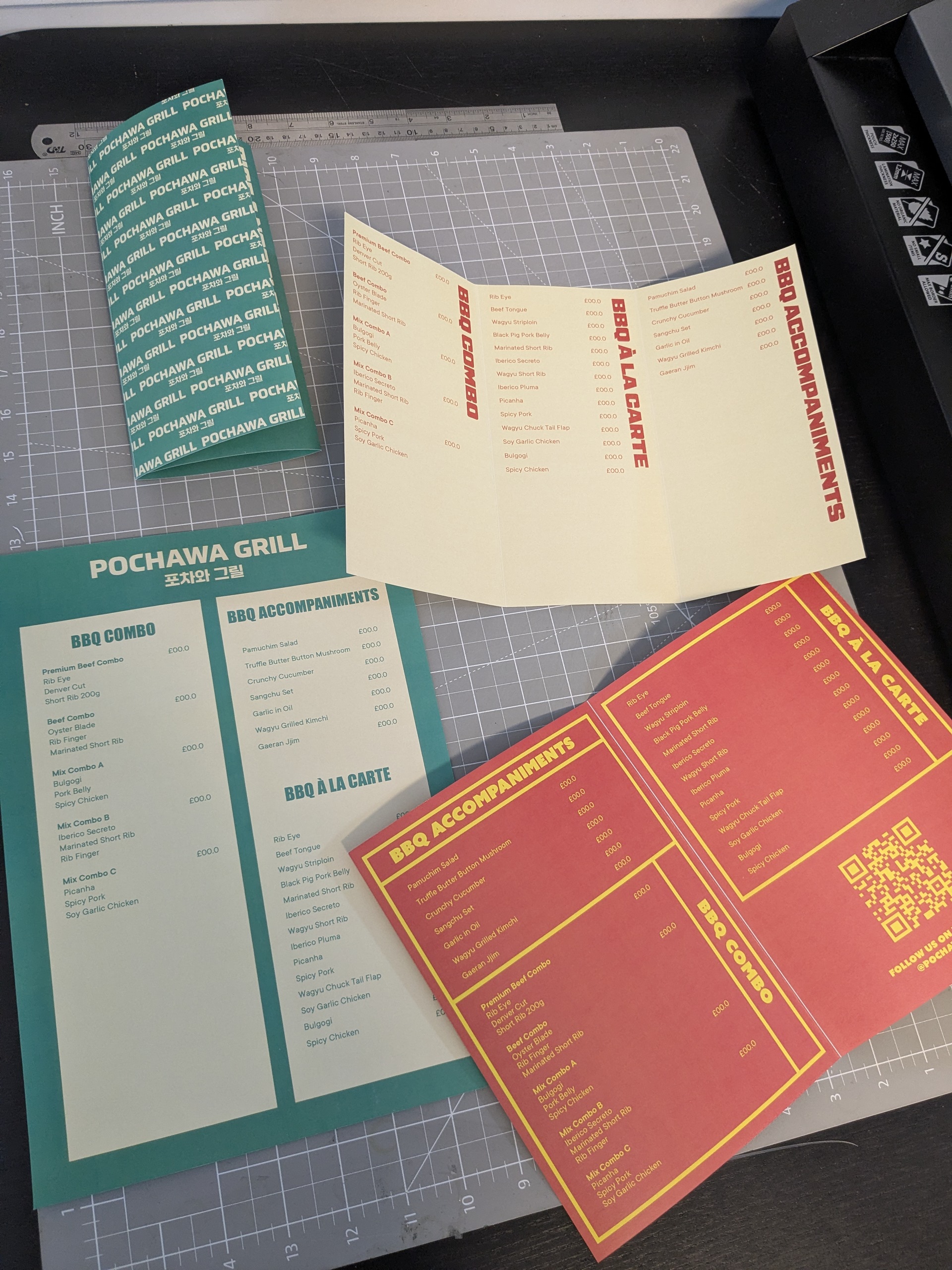
Early design explorations
Early design explorations for the new menu direction
Early design explorations while adapting the menu to a completely different communication approach.

"Removing photography didn't concern me. Removing understanding did."

Making the menu work

One proposal was to remove the dish descriptions altogether. I was the only person in the discussion approaching the menu from outside Korean culture.

Even though I grew up in Asia, I still couldn't understand many of the Korean dish names without additional context. That became the basis of my feedback.

The final menu kept concise descriptions beneath each dish. Customers no longer relied on photographs, but they still had enough information to understand what they were ordering. The visual solution had changed, but the menu still needed to perform the same job.

Reflection

Different projects naturally lead to different visual solutions. I don't try to make every project look consistent. I try to make the design respond to what the project is trying to achieve.

When the intention changes, I expect the visual language to change with it. What stays consistent is the responsibility of the design: helping people understand enough to act, regardless of whether that happens through photography, typography, illustrations or written descriptions.

Photo-led
to text-led
Direction shift
Initiated by new Head Chef's vision for the brand
Korean naming
with English support
Language approach
Original names preserved as primary language
Cross-cultural
design decisions
Perspective
Sole non-Korean voice in the discussion
Information
without photography
Outcome
Descriptions retained to preserve accessibility
← Back to portfolio ← Back to reports Next: Signage system →
hauyeedoin.com · 2026