hauyeedoin · Portfolio Field Report No. 07 Maguro Group · Multi-brand Menu Systems · 2026
Editorial Design · Information Architecture · Multi-brand

Designing menu systems
from content before visuals

Designing menus across several restaurant brands required more than giving each one a different visual identity. Before photography, typography or styling could begin, the content had to be divided into categories, distributed across pages and organised into a structure customers could follow. The visual design came later.

Client Maguro Group Project Multi-brand menu systems Role Creative Designer Scope Editorial design · information architecture Period March – July 2026
Pochawa Grill – complete menu system
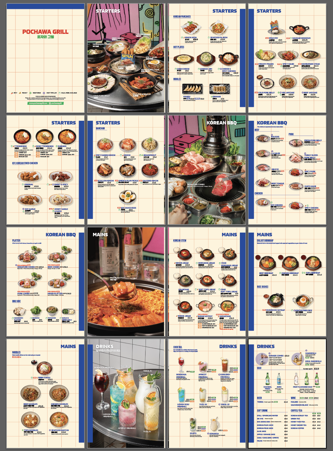
Complete sixteen-page Pochawa Grill menu system
Complete sixteen-page menu developed for Pochawa Grill. The final menu contained a large amount of photography and product information, but its page structure had been established before the visual assets were available.
The brief

Menu projects rarely began with a complete set of materials. The product list might be available before the photography. Prices might still be changing. Categories might not yet be final. Several people could be contributing information at different stages.

Waiting for everything to arrive before beginning the layout would have delayed the project considerably, particularly because organising the menu content often required more time than placing the final images.

Instead, I started with the information that already existed.

The content structure

Before considering how the menu should look, I worked out how much content it needed to hold. Products had to be classified. Related dishes had to be grouped together. Sections had to be distributed across pages.

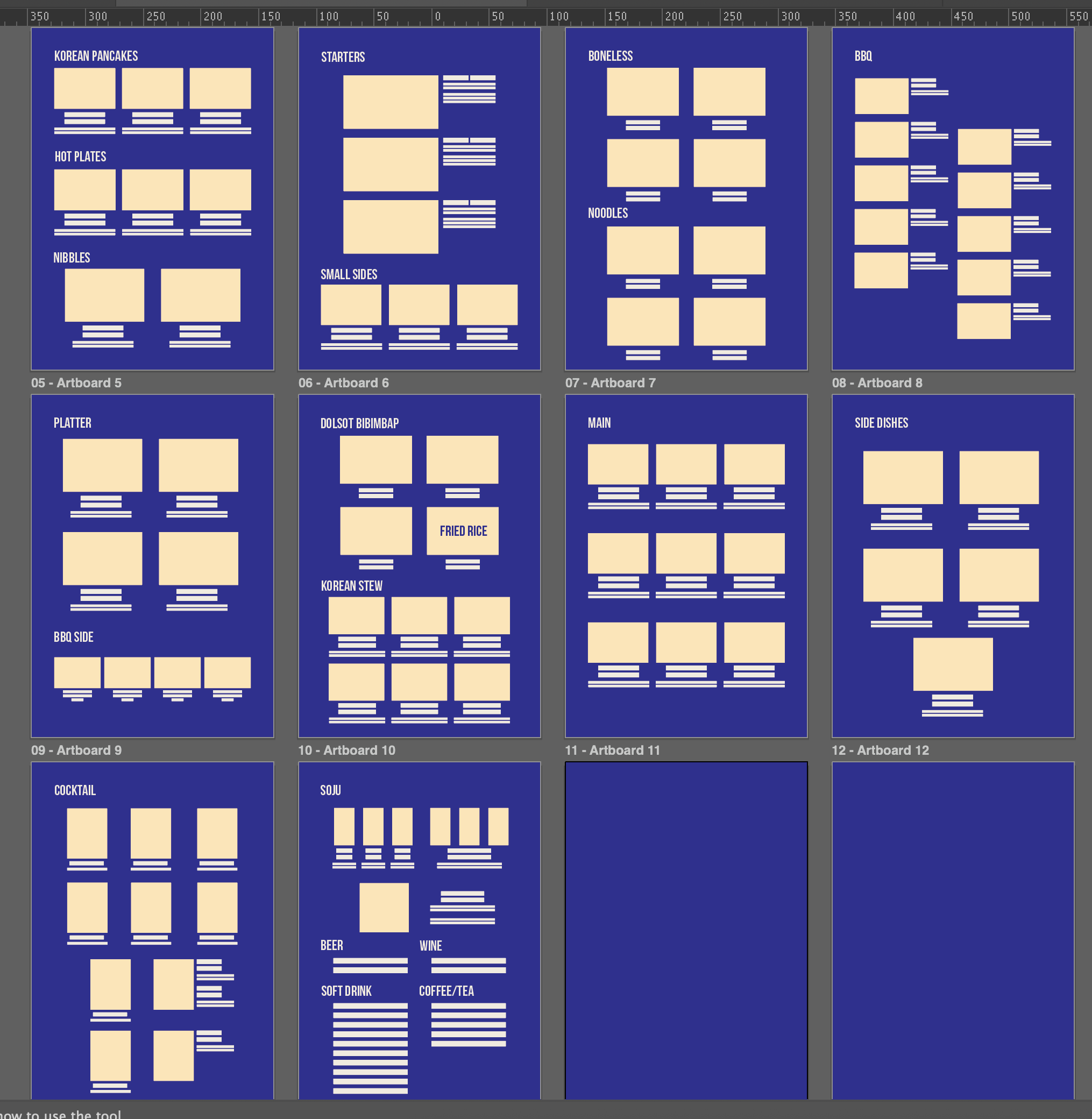
Some categories required more space than others, while certain spreads needed enough flexibility to accommodate photography that had not yet been produced. This created an early version of the menu without finished visuals – a practical way to complete the most time-consuming part of the work while other assets were still in production.

Content planning – before photography
Menu content layout planning showing page allocation and category structure before photography
Early page allocation created before photography was available. The layout established category order, approximate page capacity and the amount of space each section would require.

The reading system

Each restaurant had a different identity. Bunsik was bright, youthful and product-led. Bullgogi required a more refined dining experience. Gogi and Pochawa Grill followed their own visual direction. The menus were not expected to look related simply because they belonged to the same group.

What remained consistent was their purpose. A menu still needed to tell customers what was available, help them compare options and make it clear where one category ended and another began.

That meant the underlying structure could remain dependable even when the visual language changed completely. The design process did not begin by choosing a layout that could be repeated across brands. It began by organising information in a way that could later support different layouts.

Many of the restaurants served food that local customers might not immediately recognise from its name. A written description could explain the ingredients, but it did not always communicate the appearance, portion or way the dish would be served. Photography therefore carried part of the explanation.

As more images were added, the menu could easily begin to resemble a catalogue. Every dish competed for space. Sections became harder to separate. The purpose of the layout was not to make the menu appear minimal. It was to create enough order and breathing space for a large amount of information to remain readable.

"Before deciding how a menu should look, I first needed to know how it should be read."

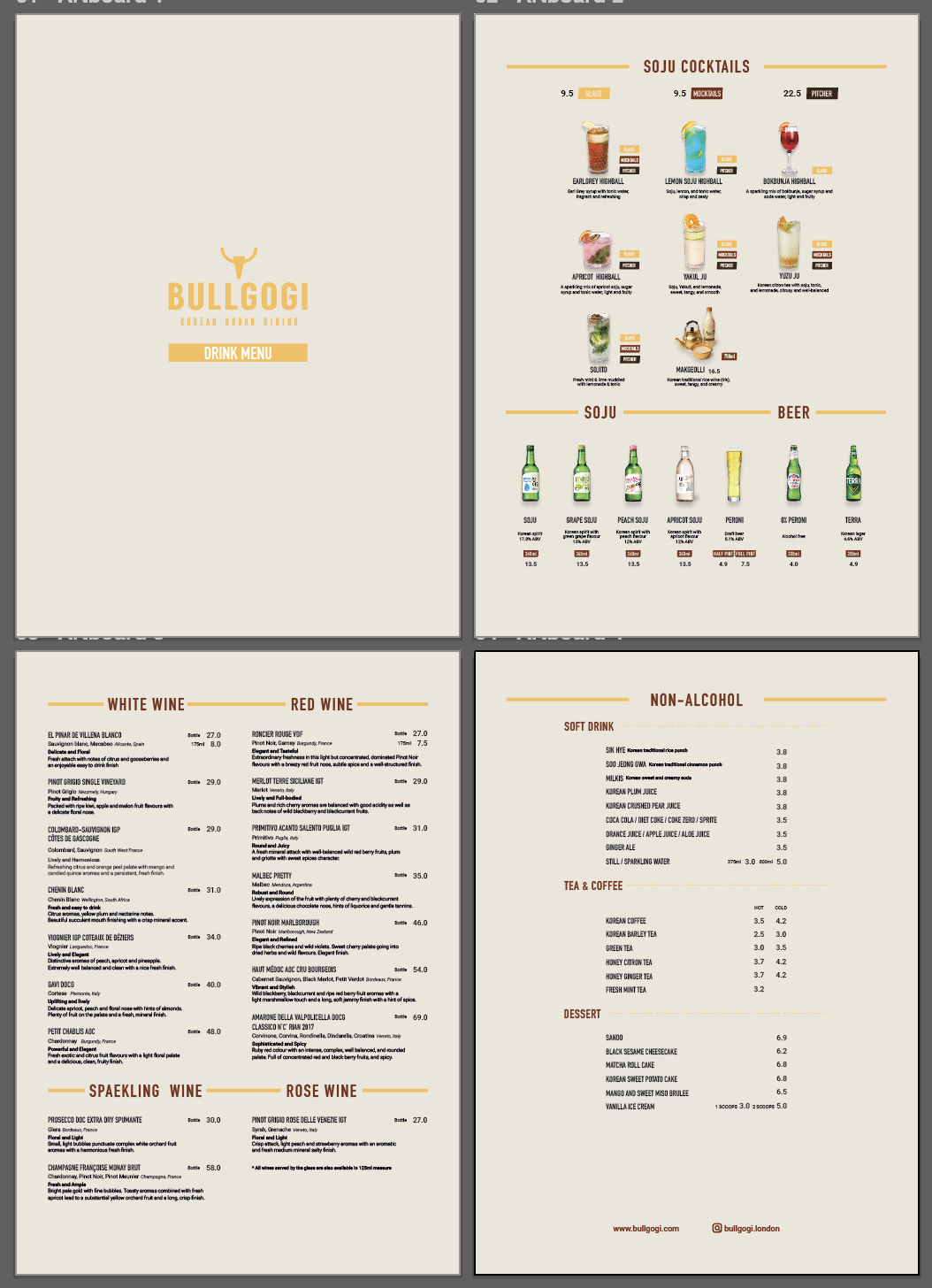
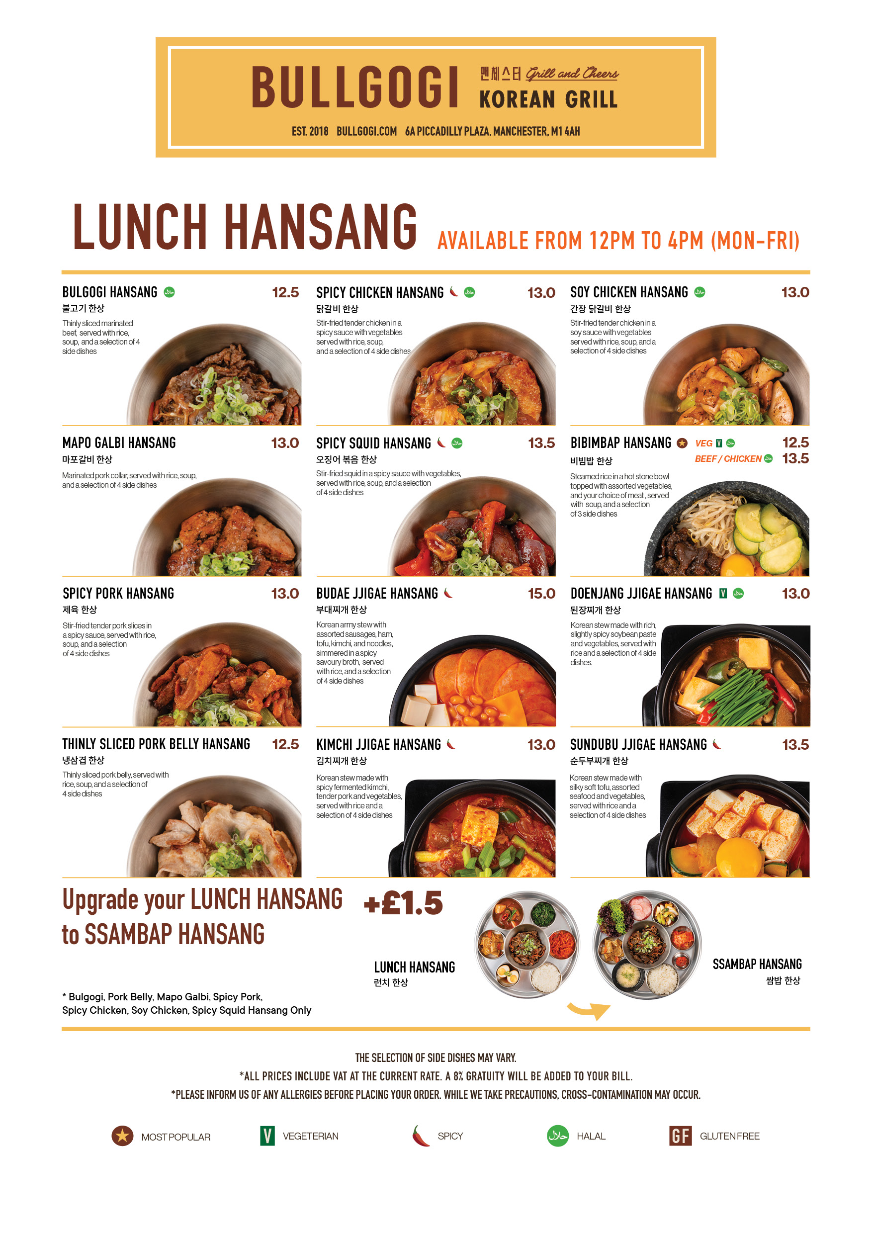
Bullgogi – menu spread
Bullgogi menu spread combining food photography with restrained visual identity
Bullgogi menu spread combining food photography, descriptions and pricing within a more restrained visual identity.
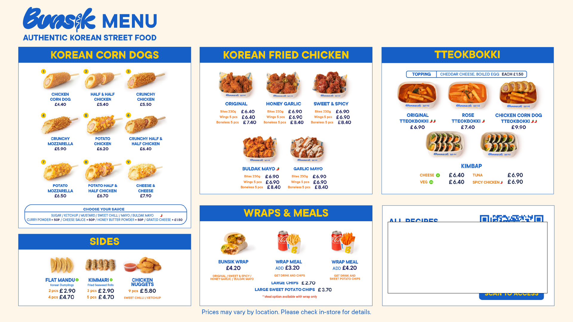
Bunsik – menu spread
Bunsik menu spread with high product density and clear category separation
Bunsik screen menu layout shown for structural reference. Specific pricing and product details have been partially obscured as this asset was produced for internal presentation use.

Working across brands

Designing several menu systems made it possible to see the difference between repeated content and repeated design. Some restaurants sold the same cocktails. The names, ingredients and photography remained unchanged because the products were unchanged. The surrounding design did not need to be identical.

Each cocktail section was rebuilt to sit naturally within the visual language of its own restaurant rather than copied from one menu into another. This allowed shared information to remain accurate without making the brands feel visually interchangeable.

The menus were developed in two layers. The first organised the content – what belonged together, how much information each page could support, and how customers would move through the document. The second translated that structure into the identity of each restaurant. Photography, typography, colour and graphic details were added only after the content had somewhere to go.

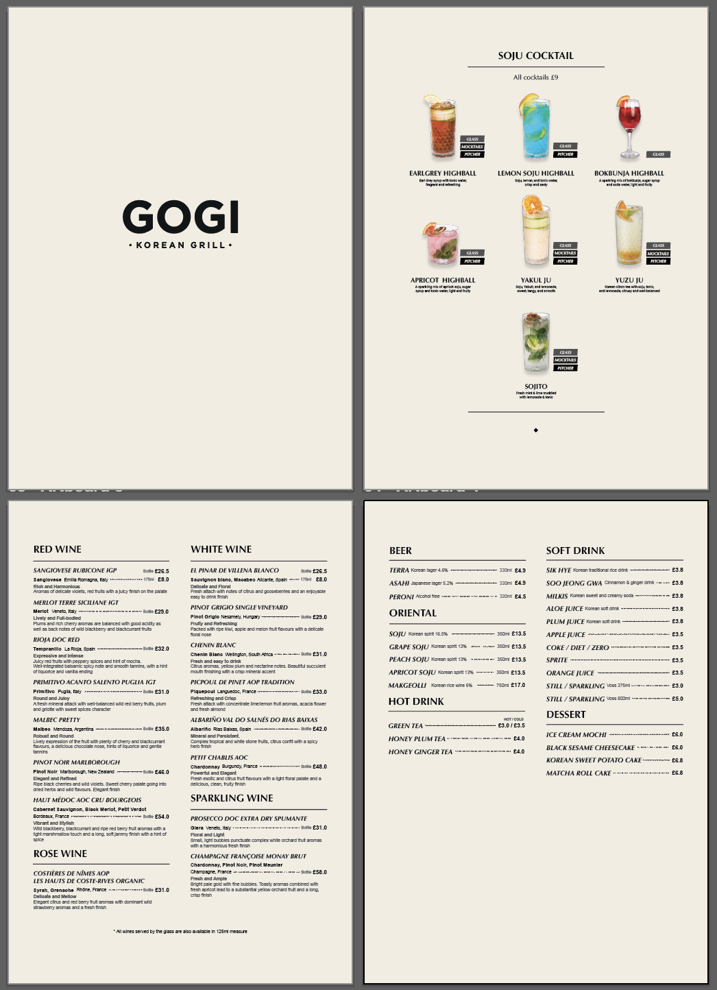
Gogi – cocktail menus comparison
Same cocktail selection adapted across different restaurant brands
The same cocktail selection adapted for different restaurant brands. Although the drinks and photography remained the same, each section was redesigned to match the surrounding menu rather than reused as a fixed template.

This work made the distinction between content design and visual design much clearer. A menu can begin taking shape before any finished photography exists. Its categories, sequence, page capacity and reading flow are already design decisions, even when the document still appears visually unfinished. The finished menus looked different because the restaurants were different. The process behind them became increasingly systematic.

4
Restaurant brands
Bullgogi, Bunsik, Gogi, Pochawa Grill
16
Pages
Largest single menu system
Content
first
Planning method
Structure established before photography arrived
Multi-
brand
Visual adaptation
One information system supporting different visual identities
← Back to portfolio ← Back to reports Next: Pochawa menu →
hauyeedoin.com · 2026