hauyeedoin · Portfolio Field Report No. 03 Maguro Group · Talent Tunnel Career Site · 2026
Brand Translation · UI Direction · Cross-functional Communication

When brand guidelines
weren't enough

The external developer had all the brand assets. The colours were correct. The fonts matched. But the result looked like a different company. This is an account of why brand guidelines fail at the point of handover, and what replaced them.

Client Maguro Group Project Talent Tunnel career site Role Creative Designer Scope Brand translation · UI direction Period March 2026
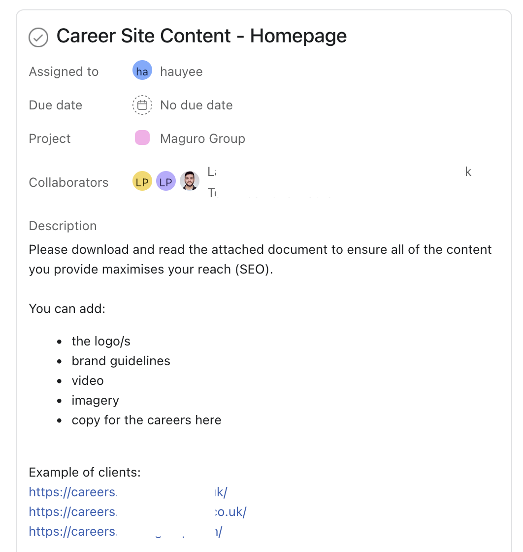
Project brief – task management
Career site project brief in task management system showing scope and collaborators
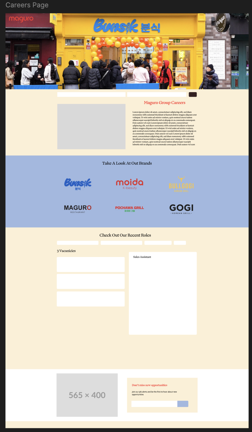
Prototype – Figma layout
Career site prototype built in Figma as a visual specification for the external developer
Left: the project brief as received. Right: the Figma prototype built as a replacement for written specifications – a visual reference that communicated what the guidelines alone could not.
The brief

The project had already begun before I joined the company. The Head of People was managing the Talent Tunnel careers platform directly with the external provider, while the Design Manager had already completed part of the work.

When I joined, there was no formal handover. My role was simply to support the project by providing imagery, website styling and other visual assets.

After a short introductory video call with the developer, production began. At the time, it felt like a straightforward handoff.


The observation

Initially, I assumed the existing brand assets would be enough. The developer had access to the same logos, colours and supporting materials that I did. From a technical perspective, nothing was missing.

However, the first implementation revealed something unexpected. The design followed the guidelines, yet it didn't feel like the existing Maguro website.

That was the moment I realised brand guidelines do not remove interpretation. They simply provide a common reference, leaving countless visual decisions to the people applying them.

The inconsistency wasn't caused by missing assets. It came from different people visualising the same guidelines in different ways.

The replacement
"Brand guidelines describe a system. They don't always describe what people actually see."

Rather than explaining individual adjustments through emails, I stopped describing the design and started showing it.

I recreated the homepage directly in Figma using the visual language already established across the company's existing website. Spacing. Hierarchy. Background colours. Content structure. Component relationships.

Instead of communicating these decisions through hexadecimal values or written instructions, the prototype became the shared visual reference. The design files were packaged and sent directly to the developer, allowing implementation to continue with almost no further discussion.

The prototype wasn't simply a design file. It became a common language.


Reflection

The project itself was relatively small. The lasting lesson was not about building a careers website, but about how visual consistency breaks down when design moves between teams.

People rarely ignore brand guidelines. More often, they interpret them differently.

That experience changed how I approached cross-functional communication throughout later projects. Whenever possible, I replaced lengthy written explanations with visual references that reduced ambiguity before it could appear.

External
developer
Collaboration
Cross-language brief delivered without written specification
Figma
prototype
Output
Visual prototype used as the sole implementation reference
Brand
translation
Method
Existing website interpreted into new platform context
Minimal
iterations
Result
Prototype reduced back-and-forth to near zero
← Back to portfolio ← Back to reports Next: Design ops →
hauyeedoin.com · 2026