hauyeedoin · Portfolio Campaign Report No. 01 Bunsik × BTS The City Arirang · London · July 2026
Campaign Identity · IP Compliance · Production Under Pressure

Building a campaign
before the campaign existed

A collaboration was announced before anyone knew what it would become. There was no creative brief, no confirmed product, no final list of deliverables, and only days before production. What began as a single sticker request became a complete campaign across packaging, digital screens, retail graphics, and customer experience.

Client Bunsik × JUNG Festival Approval authority HYBE Event 4–10 July 2026 Post-approval timeline 7 days Stickers distributed 90,000+
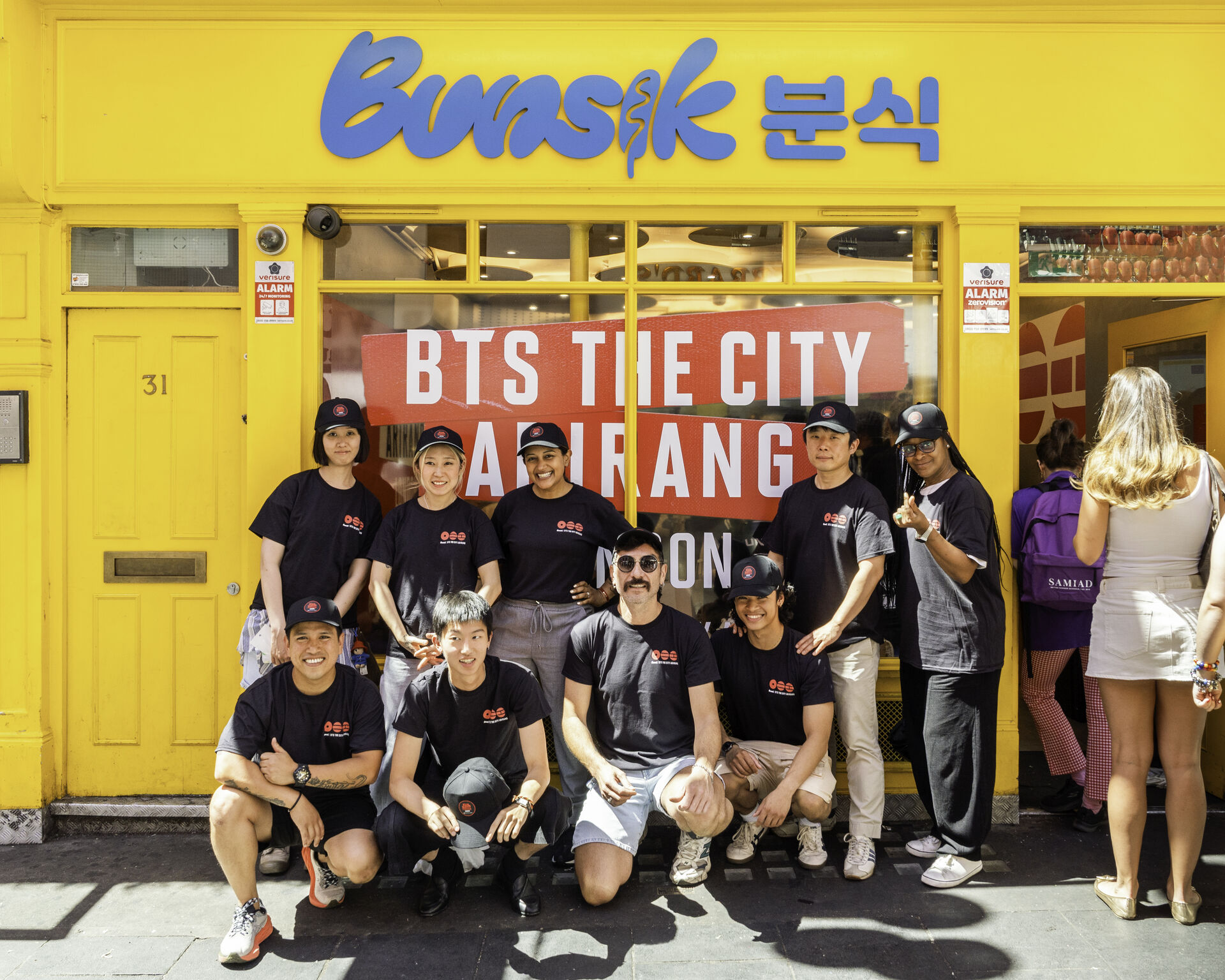
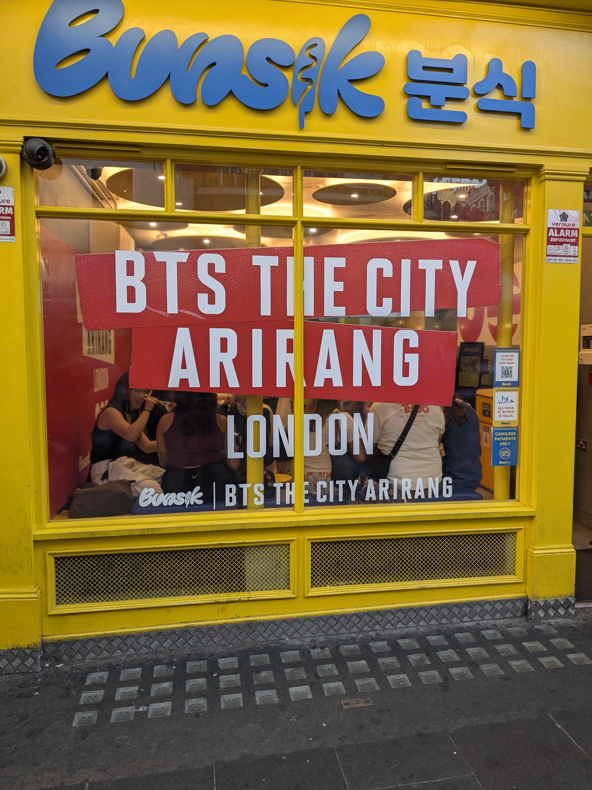
Bunsik Leicester Square storefront with BTS The City Arirang window graphic
Storefront transformation, Bunsik Leicester Square. Window graphic designed, approved, printed, and installed within the seven-day post-approval window.
The problem

The first conversation sounded simple. Marketing expected a collaboration and believed only a small promotional sticker would be needed for a dip box. The event details were still unclear. The campaign identity had not been defined.

A week later, the project officially began. Nothing was as expected. There was still no creative brief. The food had not been decided. The campaign mechanics were unknown. Even the list of required assets did not exist.

The only confirmed information was that artwork had to be submitted to HYBE for approval by Monday.
"The campaign had no clear shape, yet production had already started."

The first challenge was not visual design. It was understanding what could legally and creatively exist within the boundaries of the approval framework.

The investigation

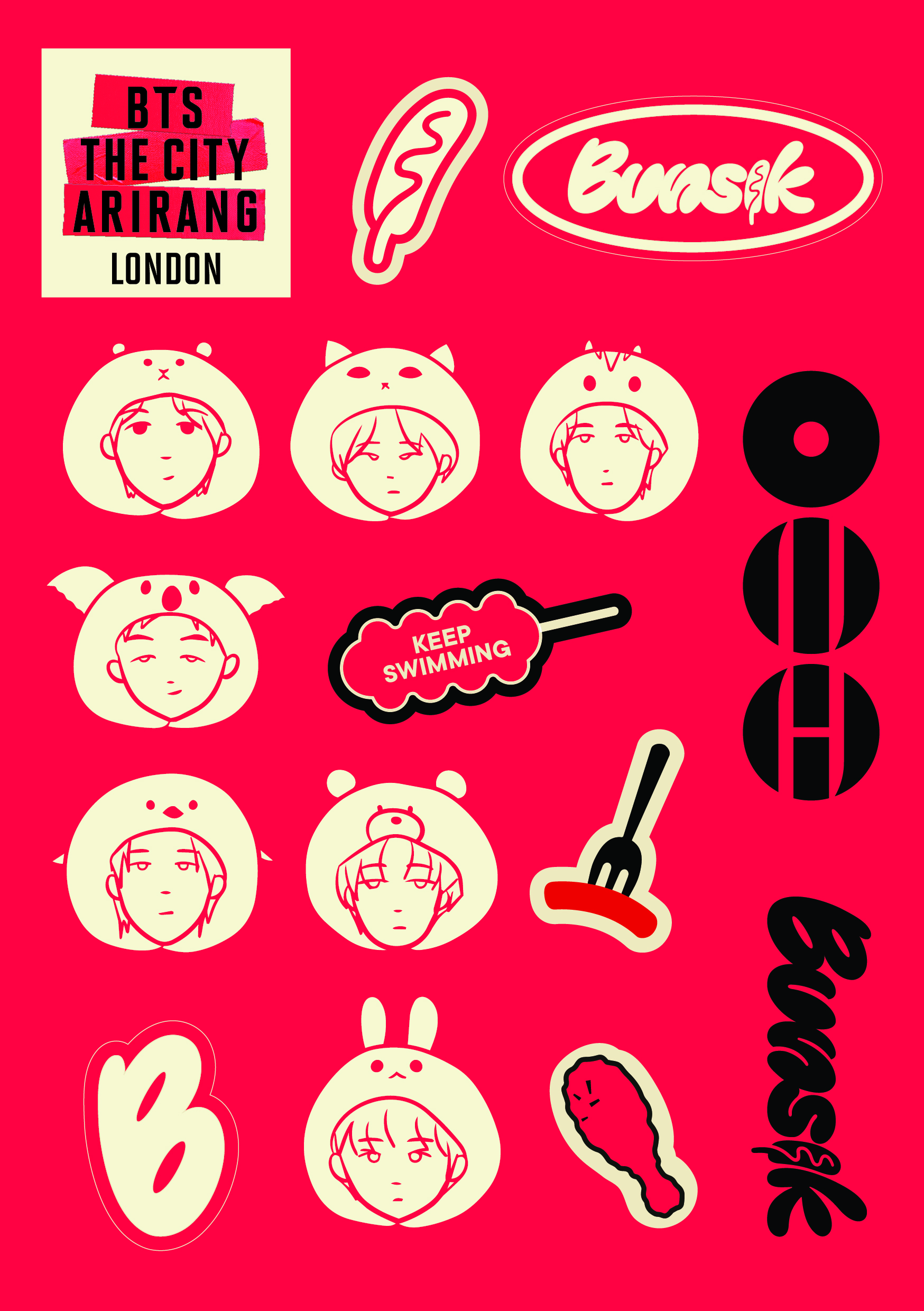
Initially, illustrated character stickers inspired by the members were explored, believing this would create something personal for fans. Those concepts were rejected. HYBE made it clear that nothing could directly represent the artists or imply an official character licence.

Only through repeated approval rounds did the real structure become clear. The partnership was not with HYBE itself. It was organised through JUNG Festival, while HYBE acted only as the approval authority protecting its intellectual property.

That distinction completely changed the design approach. Instead of building a campaign around the artists, the visual language had to celebrate the event while remaining recognisable to fans without crossing licensing boundaries.

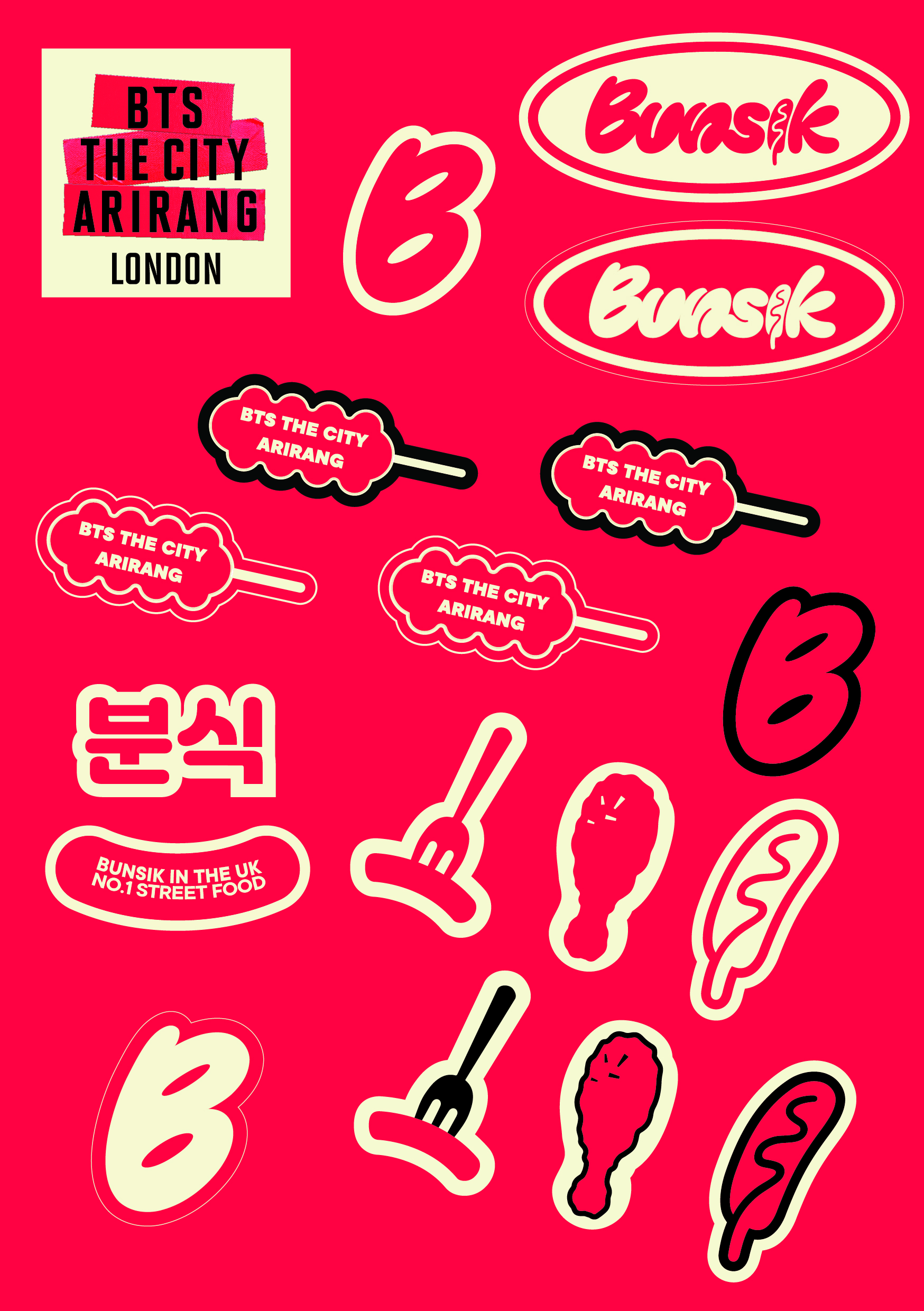
The final identity shifted away from character illustrations and focused on original Bunsik assets, event graphics, and custom promotional elements that could legally exist within the approval framework.

"The campaign was designed while the campaign itself was still being defined."

Design decision evidence – three sticker versions
Version 01 Rejected
First sticker concept with character illustrations – rejected
Character illustration concept. Rejected by HYBE – directly represented artists and implied an official character licence.
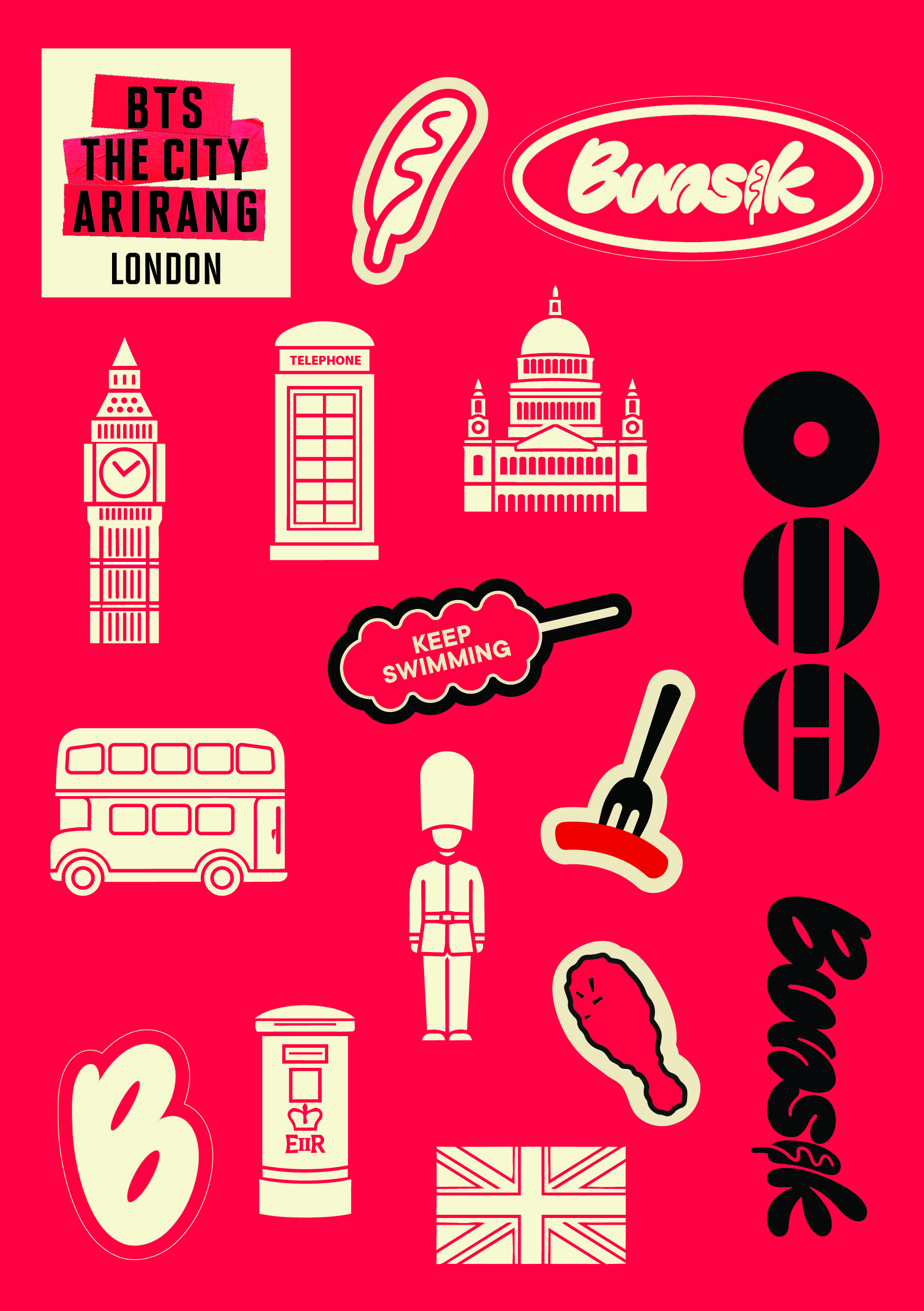
Version 02 Interim
Second sticker concept with London icons
London icon approach. Shifted away from artist representation toward event and location identity.
Version 03 Approved
Final approved sticker sheet with Bunsik brand elements
Final approved version. Pure Bunsik brand assets, event identity, and food illustrations – no artist reference.

Expansion

As approvals continued, the scope expanded almost daily. The campaign was no longer a sticker.

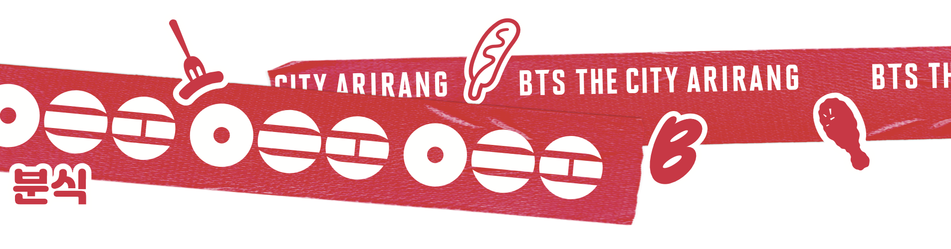
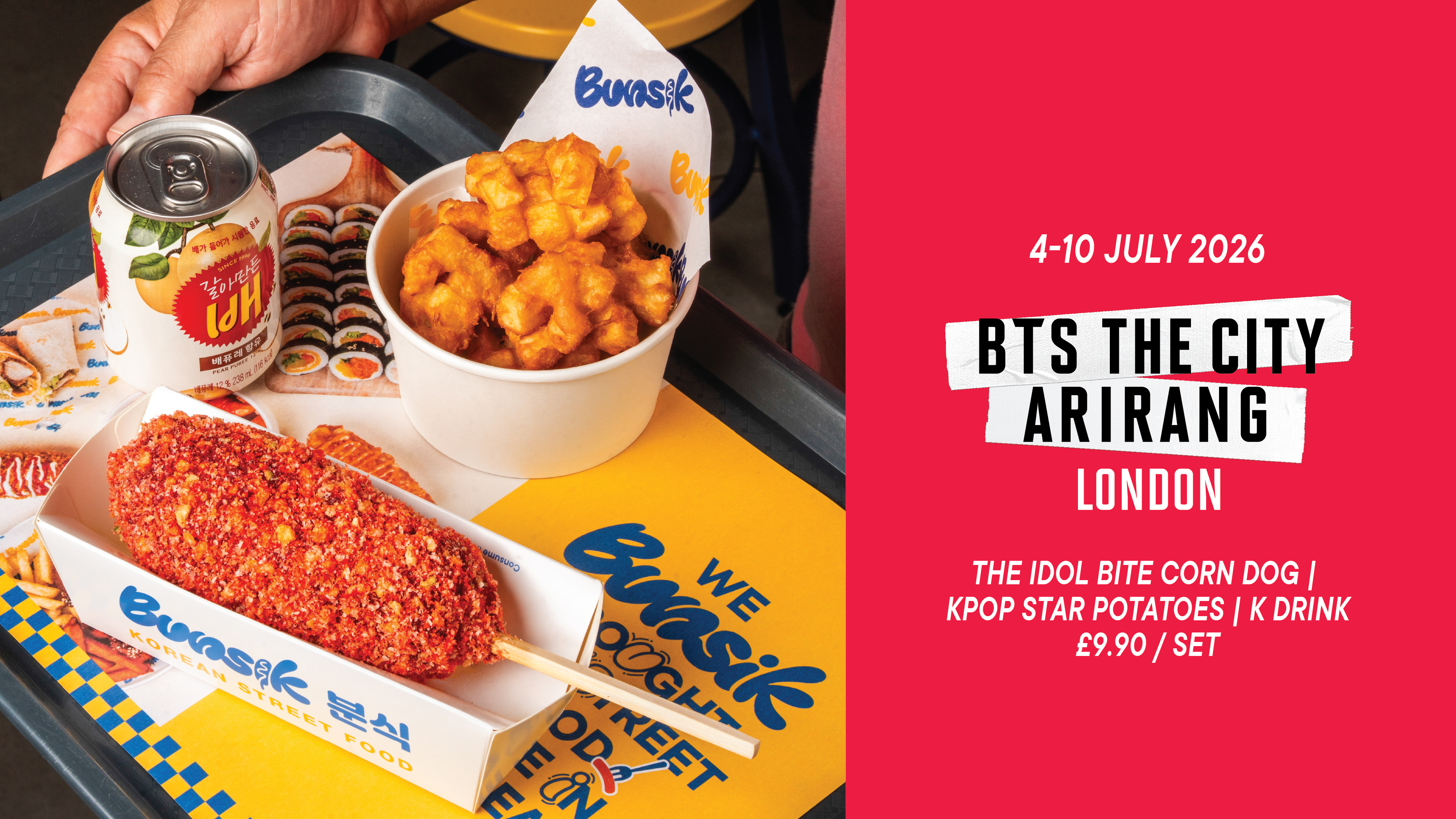
New menu visuals were required once the BTS meal was finalised. Packaging tape had to be created. Promotional sticker packs for customers were added. Digital menu screens had to be updated. Retail posters were needed. Window graphics transformed the entire storefront.

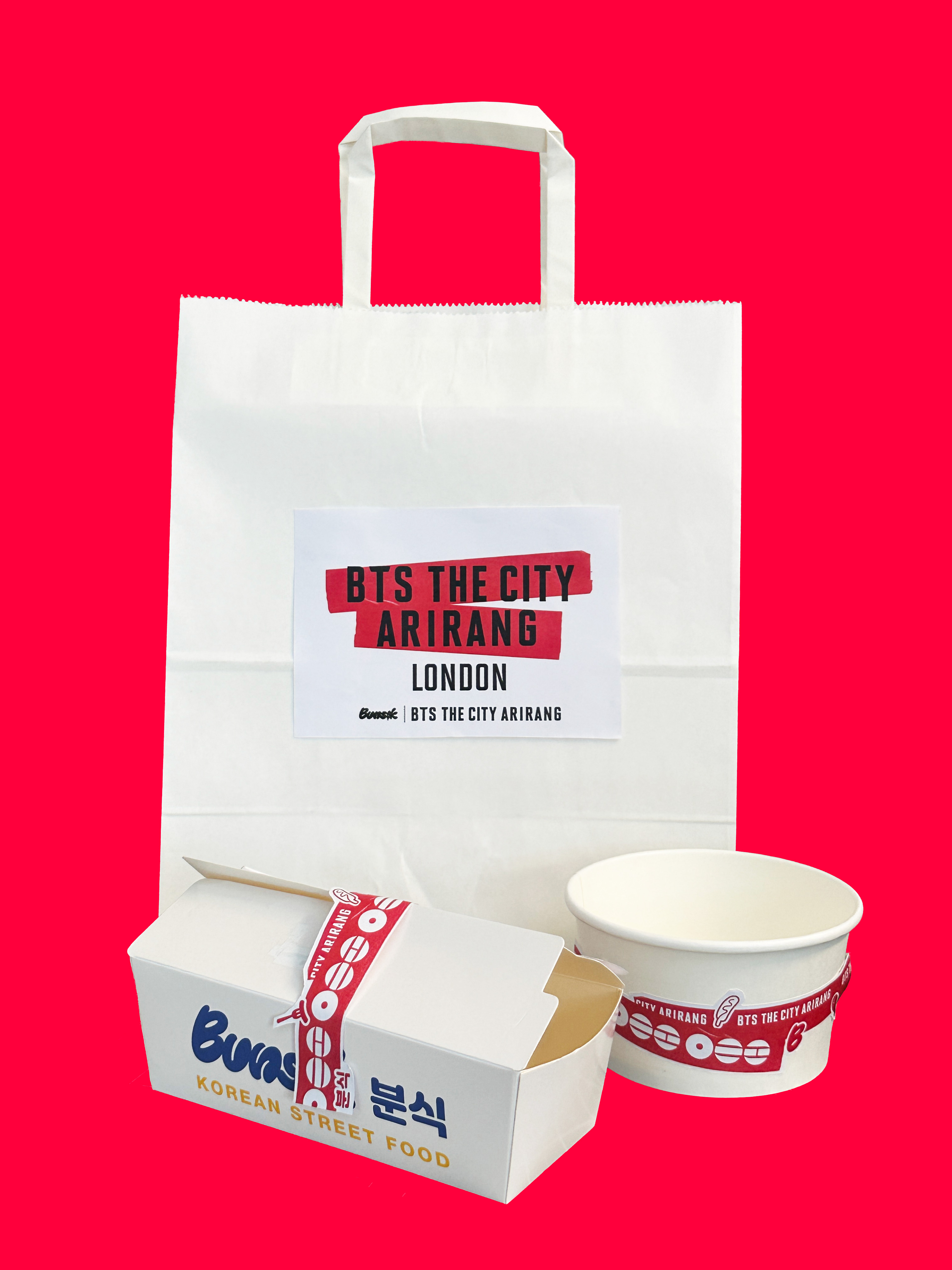
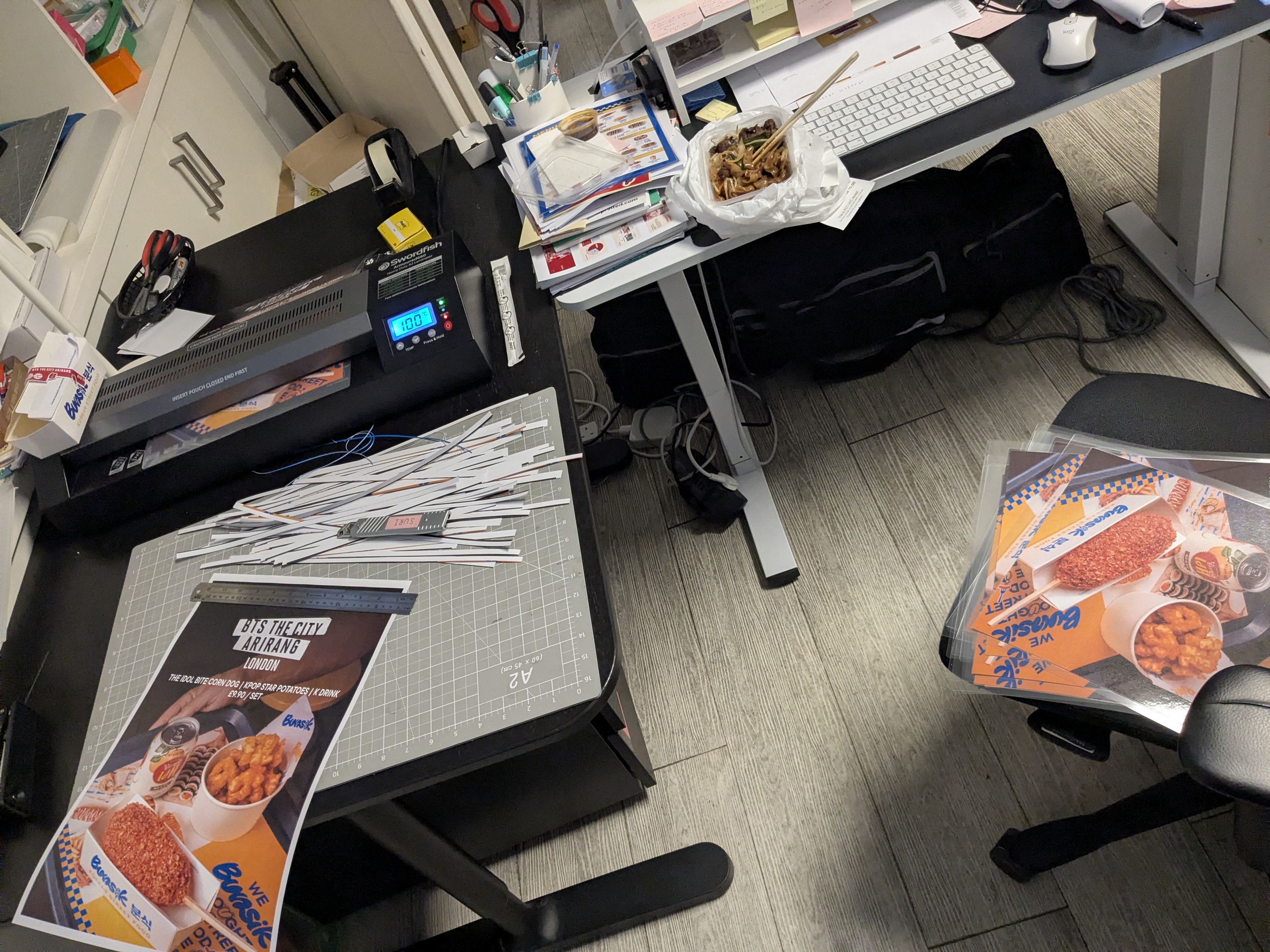
Emergency bag labels were produced in-house while commercial printing was still in progress. The branding system grew faster than the original plan, yet the launch date never moved.

Packaging tape artwork design
Packaging tape artwork – custom designed for boxes and cups across all branches.
Campaign assets produced
Digital menu screen showing BTS meal
Digital menu screen – BTS meal set at £9.90, updated across all branch screens.
Packaging system including bag, box, and cup
Office mock-up of the proposed packaging system, created to communicate the rollout to warehouse and store teams before final production.

Production
Office emergency production with laminator and cut materials
Office emergency production. Laminator, cutting mat, and A3 printed posters. Commercial deliveries had not yet arrived – stores needed materials on day one.

Once the artwork was finally approved, only seven days remained before launch. Printing suppliers had to be sourced immediately. Production specifications were rewritten around available lead times. Artwork was adjusted to suit different cutting methods.

Budgets were negotiated while files were still being prepared. Emergency materials were printed internally using office equipment so stores could operate even before commercial deliveries arrived.

Distribution became another design problem. More than ninety thousand stickers had to be allocated according to expected sales volumes across different branches so every location would have sufficient stock throughout the event.

At this stage, design was no longer about creating graphics. It became production planning, logistics, and decision making under severe time constraints.


Outcome – the environment on launch day
Store team in front of installed window graphic on launch day
Store team in front of the installed window graphic on launch day.
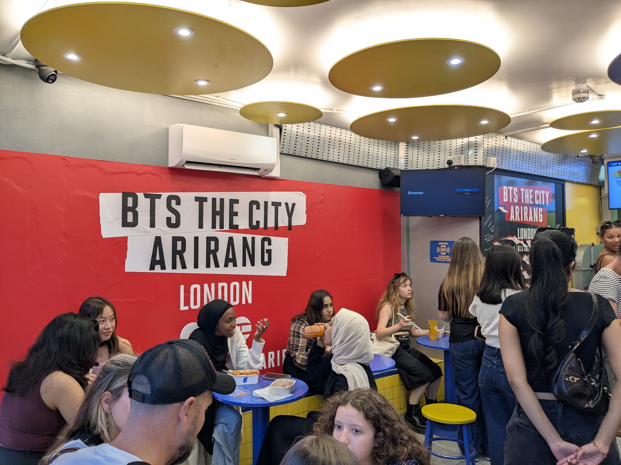
Store interior with BTS wall graphics and customers
Interior environment – BTS The City Arirang wall graphics and branded digital screens.
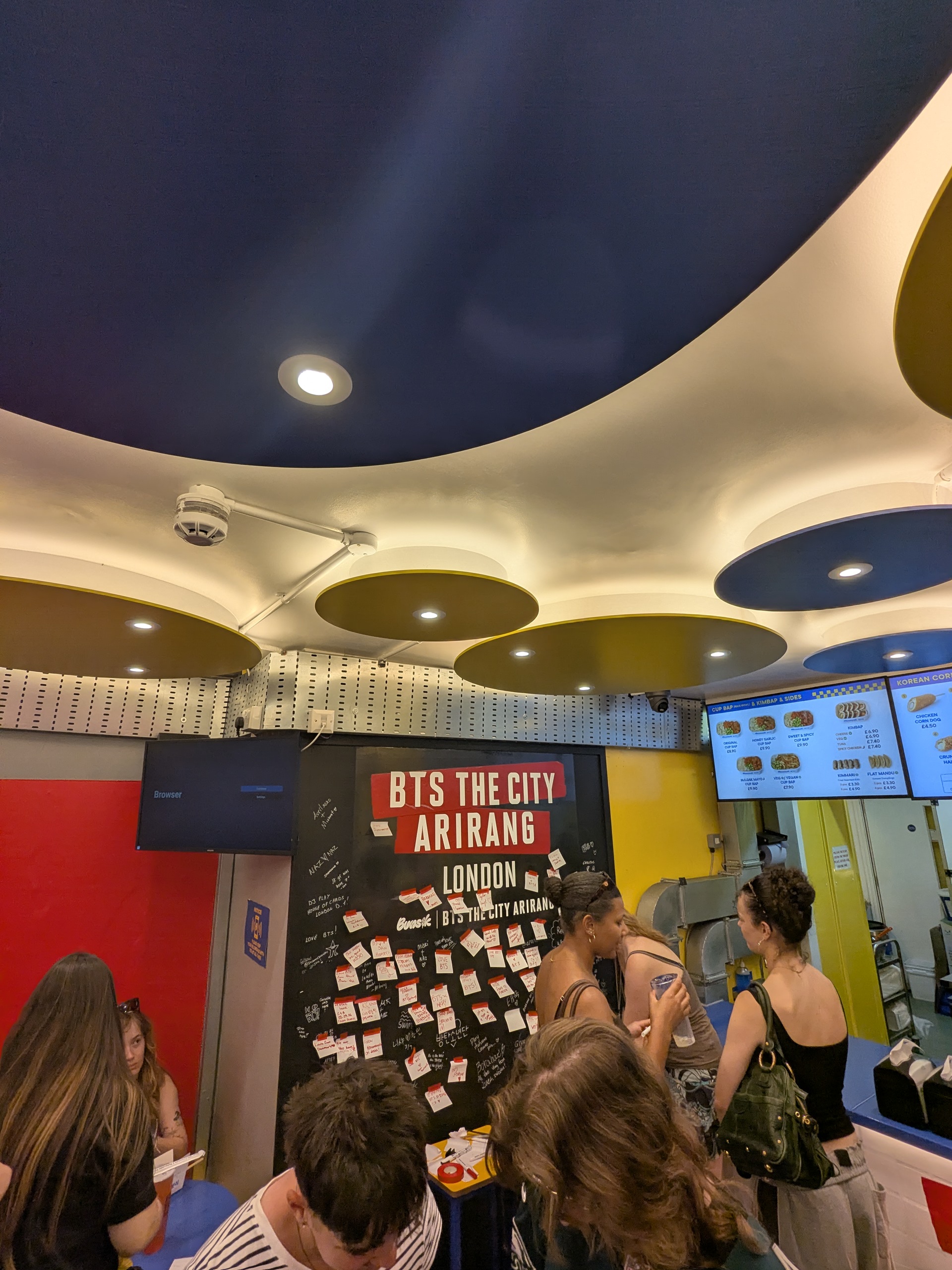
Interior wall with campaign graphics and message board
Fan message board and campaign wall. Members of the JUNG Festival team noted the level of completion given the compressed schedule.

When the event opened, visitors experienced a fully branded campaign. Packaging, retail graphics, digital displays, promotional materials, and customer giveaways all shared one visual language despite being developed under changing requirements and an extremely compressed schedule. The campaign succeeded not because every answer was available from the beginning, but because decisions continued to be made while the project itself was still taking shape.

7
Days to launch
From final approval to store opening
90k+
Stickers distributed
Allocated by branch sales volume
3
Approval rounds
Before identity framework was confirmed
5
Touchpoints
Packaging, screen, print, environmental, giveaway
← Back to portfolio ← Back to reports Next: Window graphics →
hauyeedoin.com · 2026